Alder + Co
Flexbile Homepage Layouts

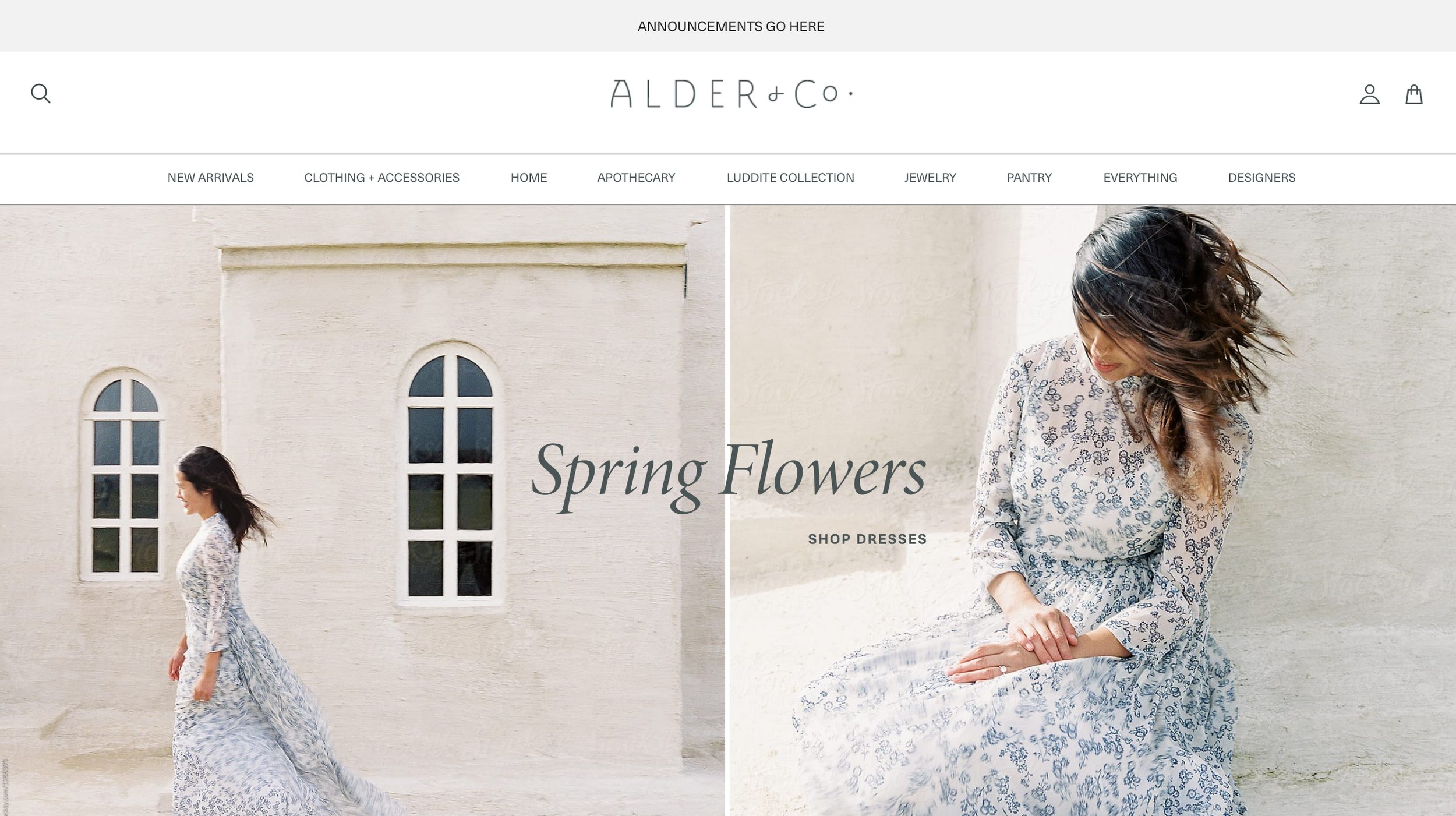
Seasons change, but not as quickly as trends. Merchandisers have long recognized the power of novelty in captivating customer imaginations. Just as a titillating storefront display can draw in passersby, the homepage serves as its virtual counterpart. When Alder + Co sought greater flexibility for their online presence, we responded by designing a suite of modular features. These modules provided a range of options for showcasing new content on their homepage. With this solution in place, our client gained the ability to curate fresh experiences for their customers with ease—no custom coding or manual design work required.

A New
Navigation
Alder + Co boasts a seasonal inventory of over 400 active SKUs, which presented them with a challenge; their existing navigation structure lacked the necessary organization to guide browsers effectively and offer targeted categories for customers seeking specific items. To address this issue, we conducted a thorough analysis, including a card sorting activity and review of site analytics and search data. This allowed us to develop a revamped navigation structure tailored to the needs of the merchandisers and customers. This new structure isn't cast in stone, we are keeping an eye on the analytics and will continue to improve its effectiveness over time. Everything on the internet is 'alive'.

Curated Collections + Seasonal Features
While the homepage sets the bait, it's wonderful to offer customers a deep dive into a seasonal collection or a 'deep cut' on a brand to build affinity and interest. Our design presented the opportunity to display curated collections within a product listing page. This helps to extend browsing time and offers an opportunity for surprise and delight.